Following on from the Beauty Room makeover post is our kitchen renovation. We completly renovated our 25 year old house before moving in last summer. It was our first home and we had so much help from willing parents and tradespeople too.
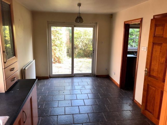
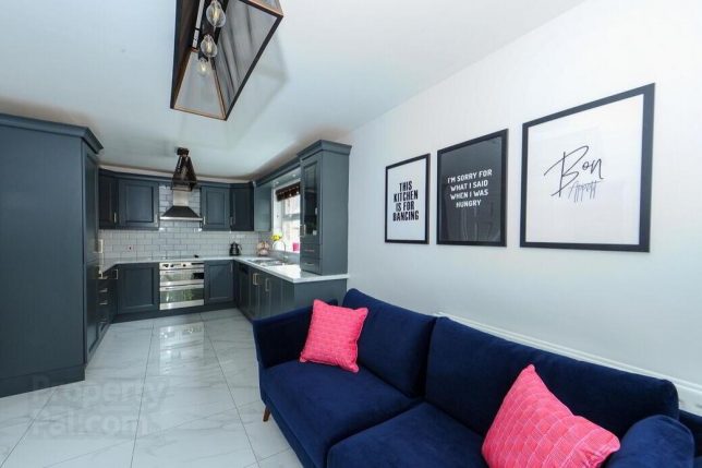
When viewing the house initially the kitchen was a room that was high up on the list of importance, you spend so much time in the kitchen so I wanted it to be a space I enjoyed being in. Although the house was very run down and unloved, it had the potential we were looking for. The classic U shape kitchen was appealing, compared to other houses we viewed with an L shape layout which meant fewer cupboards and less storage space. A nice big window at the sink that let in a ton of natural lighting, and room for a dining set or snug sofa area with french doors out to the back garden. The kitchen is at the back of the house and off it is a tiny but super useful utilty room that we would be lost without.
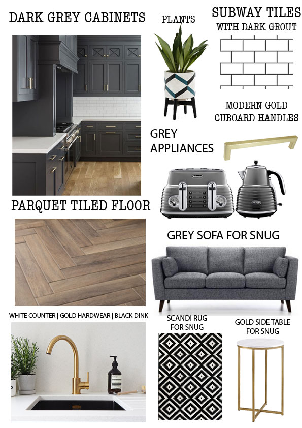
As with the beauty room, I had used Pinterest to save loads of inspo on what we liked and even made up a quick ‘mood board’ using photoshop to narrow down what we wanted and gave us a vision of what we were aiming for. This helped SO much when it came to shopping for paint colours, tiles etc becuase we had a pretty concise list of what we needed to purchase rather than going into a shop and being totally overwhelmed by choice. Of course some things did change but it really helped to have a plan for guidance when it came to shopping for the renovation.
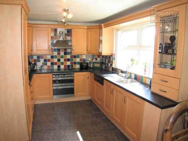
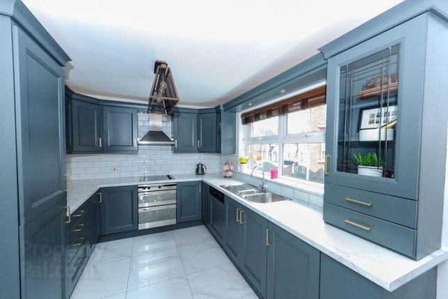
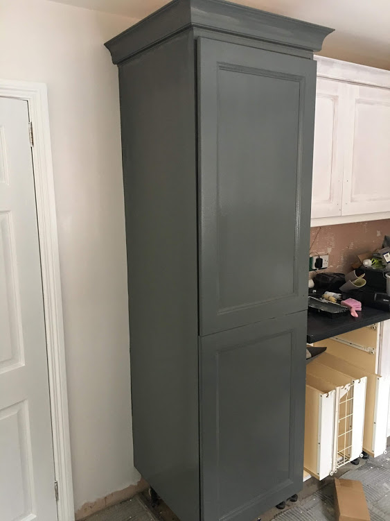
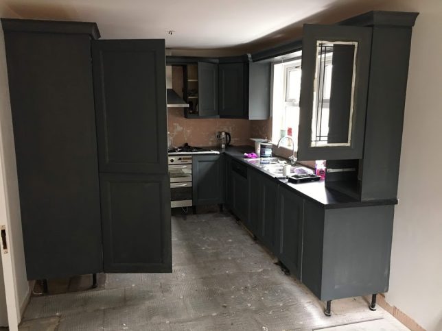
When it came to renovating the kitchen, we were lucky in that the cupboards were great quality and in good condition, so we opted to paint it. This was ideal for us and was obviosuly cheaper than replacing the kitchen and is a great way to keep costs down. If you are renovating a kitchen too and find that the cupboards are a little run down and needing replaced, always check if you could keep the ‘carcass’ of the kitchen and just replace the doors. This is another way to save some money.
After painting we added new brushed brass handles which we ordered from eBay for a couple of pounds each – I can’t find the exact ones that we purchased to link but there are loads of similar styles available. *Tip* when ordering handles, order a few spare in case of damages. Just one year later the ones we purhcased are unavailable so it is always good to have backups!
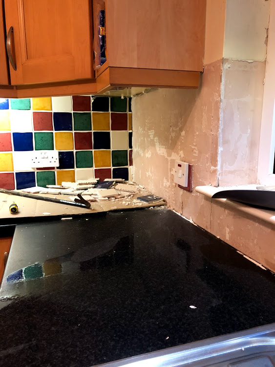
We knew we wanted white subway tiles, we brought home samples from a Belfast store, but ended up getting other tiles from Tileplus Ballymoney Ballymoney so for convenience got the white subway tiles from them too. We chipped of the old rainbow tiles ourselves – this meant saving on labour hours for the tiler, and doing little jobs like this meant we felt super involved and hands-on in the renovation.
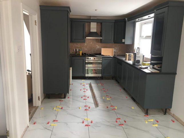
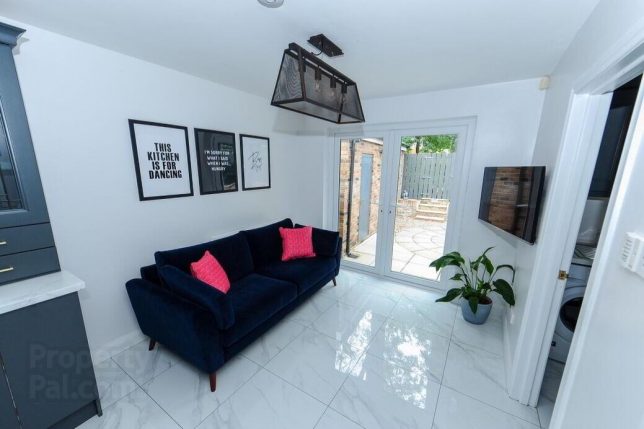
For the floor we opted for a glossy white marble tile – having lived with these tiles for just over a year I can confirm I will never buy white glossy tiles ever again! Lol they really look the part when they are freshly cleaned but with a dog and the french doors directly to the outdoors they are quite literally impossible to keep clean. Definitely a lesson learnt in our first renovation – next time I would opt for something similar to what we installed in our main bathroom – a grey concrete effect tile – they are so easy to keep and always look great even if they are overdue a mop!
Once the painting and tilling was complete we swapped out the old dark counter top for a white marble effect version to compliment the floors, brighten up the space and tie everything together. This change made such a difference to the overall look and I am so glad we went ahead with the change as it was something a little extra as the counter didn’t *need* to be updated.
After going back and forward on whether to put the dining room in the kitchen and use the spare downstairs room as a snug, or use the spare room as a dining room and have a kitchen sofa we decided to go for the latter. We had our minds set on a velvet sofa and sourced our royal blue three seater from EZ Living – the Kendal. It was the perfect size to fill the wall with a little extra room for a side table or floor lamp. It has been surprisingly easy to look after, we just use a lint roller to remove any fluff!
I came across a post on Instagram that featured SlayMyPrint prints and totally fell in love. I can take no credit for this line up as it was pinched from the image I stumbled upon, the three prints still make me smile and have been a great talking point/giggle for visitors in the house too – particularly “I’m sorry for what I said when I was hungry” (we used these cheap Amazon frames & they worked a treat)
I would have loved for the kitchen to have spotlights but we didn’t fancy installing them so just made the most of the pendant light fixtures that were there. We wanted to make a statement with the lights and went for two of the Maddox mesh pendant lights. These were £100 each from Matalan but have since been discontinued, I still love them a year later and I’m so pleased we went for something a bit different.
A couple of finishing touches
– we kitted the whole house out from Make My Blinds (this is not affililated but they did #gift our blinds for the living room and we bought the rest of the blinds for the house from them because we loved them!)
– no room would be complete without a plant! The peace lily in the kitchen is from Ikea and we have it potted in a grey ceramic pot from Homebase
– our kettle and toaster are the De’Longhi Scultura range, we keep the toaster in the utility to to maximise counter space in the kitchen links for Kettle and Toaster.
We’re so pleased with how the room turned out, it was certainly a learning experience and if you are eagle eyed you may notice Property Pal watermark on the after pictures. During lockdown we sold our first home and are in the process of securing our next renovation project… I can’t wait to get stuck in and see what we do this time around!
